The hierarchy of visual representation
We are very grateful to Tom Tutton from Autism Spectrum Australia for this interesting blog.
Autism Spectrum Australia (Aspect) works with people on the autism spectrum and their families. We regularly recommend visual communication strategies because people on the spectrum often have strengths in visual learning. This is especially important in our work through Aspect Positive Behaviour Support where communication can replace challenging behaviour.
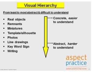
In the past, we applied a ‘hierarchy’ of visual representations based on how easily they can be understood.

Generally, objects are considered the easiest form of visual communication to understand; followed by miniatures, remnants, photos, line drawings and symbols and writing, in that order. Although this hierarchical understanding is held true for many people on the spectrum, there can be exceptions. Some individuals find line drawings easier to understand than photographs.
Aspect Practice continually reviews and applies the evidence base to our daily work. So, with the knowledge that the hierarchy does not fit for some people, we reviewed the research literature to see if we could refine our understanding and use of visual communication strategies.
We asked “What evidence is available about the hierarchy of visual representation which could explain how an individual could benefit more from line drawing supports than photos?”
To find the answer, we searched an electronic research database, prioritised 20 papers and then reviewed four papers in detail that seemed to answer our question (references below).
We found information that suggests the factors contributing to a person’s understanding of visual symbols is broader than a simple hierarchy and involves consideration of three main areas:
The individual’s experience
- The individual’s ability to learn
- ‘Iconicity’ of the symbol (more detail about this piece of terminology below)
Ideally, these factors should be considered for every symbol used with every individual. We learned that a symbol can be placed on a continuum in terms of ‘iconicity’. At one end, it can be described as “iconic” or “transparent”, meaning that it is very similar to the object it refers to (e.g. using a juice bottle to present the choice of juice). At the other end, it can be described as “arbitrary” or “opaque”, meaning that there is little or no visual similarity between the real item and the symbol (e.g. the written word “bird” does not look or sound anything like an actual bird).
The generally accepted hierarchy of visual representations aims to organise types of symbols by their level of iconicity, but misses some subtleties. This means that phrases such as “photos are easier to understand than line drawings” are often overgeneralisations.
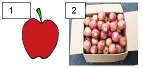
For example, image 1 looks more like an apple than image 2, even though the second one a photograph. Image 1 would also be easier for an individual to understand if that symbol had been used extensively around them, if it was motivating and functional and if that individual had a strong ability to learn the association of that symbol and an actual apple. Therefore, a person’s ability to understand a symbol does not depend on its iconicity alone, but the ways symbols are used and learned.
In answer to our question, there are several possible explanations why a person may understand line drawings better than photos.
They may have been exposed to line drawings more than photos, meaning they can learn the associations between line drawings and things in the real world more effectively.
- The photos being used contained a background (and had lower ‘iconicity’), whereas the line drawings provided a simple representation on a plain white background.
- The person’s learning style may mean they learn each symbol individually, rather than learning how to associate symbols the real objects in a more general way. If a person who learns this way is exposed to more line drawings, they will learn more through line drawings.
As a general statement, it is clear that greater emphasis needs to be placed on the needs of the individual, as well as the properties of the individual symbol, rather than considering only a hierarchy.
Steve Davies (Positive Behaviour Support Specialist & Speech Pathologist, Aspect Therapy)
Dr Tom Tutton (National Manager, Aspect Practice, Positive Behaviour Support Specialist)
References
- Fuller, Lloyd & Schlosser (1992) Further Development of an Augmentative and Alternative Communication Symbol Taxonomy, AAC Augmentative and Alternative Communication, pp67-74
- Sevik & Romski (1986) Representational Matching Skills of Persons with Severe Mental Retardation, AAC Augmentative and Alternative Communication, pp160-164
- Stephenson & Linfoot (1996) Pictures as Communication Symbols for Students with Severe Intellectual Disability, AAC Augmentative and Alternative Communication, pp244-256
- Dixon, L. S., (1981) A functional analysis of photo-object matching skills of severely retarded adolescents, Journal of Applied Behaviour Analysis, 14, pp465-478
This article was inspired by a blog post written by Dr Joan Murphy, Co-Director, Talking Mats.
Click here to read original blog
Aspect Practice is an initiative where Aspect shares its evidence based practice through information, workshops and consultancies. To learn more about Aspect Practice, visit www.autismspectrum.org.au/content/aspect-practice.
 Online training login


